First off, it looks good. I do, however, have some comments... I apologise for their random nature, but I'm writing this down as it occurs to me. I'll be able to put some semblance of order to it later on, perhaps.
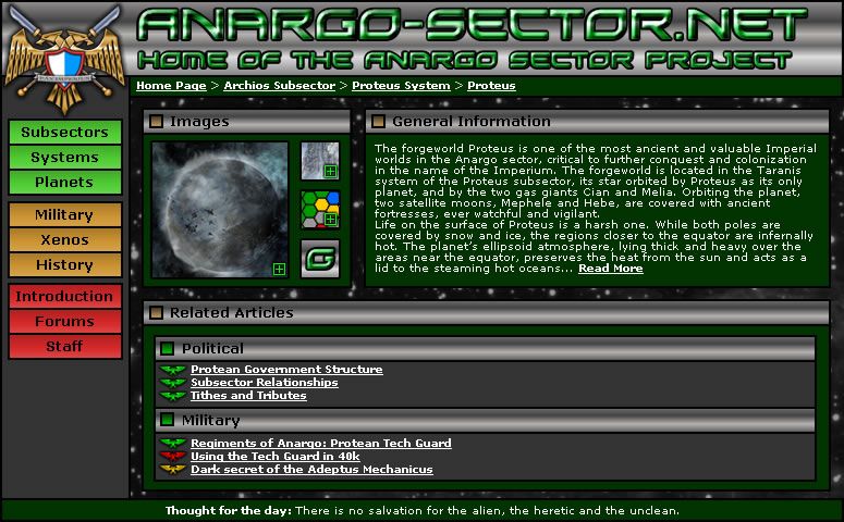
HeaderI would say reduce the size of this. It really doesn't need to be that big does it? I'd also say remove the "Home of..." and just leave "The Anargo Sector Project", centralised under the "Anargo-Sector.net" text.
We also have that "Star Trek" font again. I would suggest the use of something similar Copperplate Gothic Light or Bold. Change the font colour to 'gold' with a black liner to it.
Keep the 'crest' the same size, but (?) extend the silver to encompass the entire thing...?
Staff, ForumsThis strikes me, along with the 'search box' as being more appropriate directly underneath the 'header' (i.e. search box on the right hand side with 'buttons' for the various options). There should be other Navigation options...
Icons for Game, Meta, etc. KnowledgeYou've used colour coding and I think that works well. I notice, however, that you use the Imperial eagle as a 'thread' symbol. Might I suggest additional icons that work either in compliment to or in replacement of the colour-coding system (remembering that colours give me a headache!)...
- Imperial Eaglerepresents that information in the 'link' is "public knowledge", at least isofar as the game is concerned. (E.g. it is present in a database of some description.)
- Inquisitorial =][= represents information that would only be known to higher ranking members of the Imperium or which is otherwise 'privileged'. Detailed information on the adeptus mechanicus might be contained in this (?).
- The Kage Skull or whatever. The information in this thread represents out of game (OOG) knowledge, or knowledge that would not be accessible from the Imperium's perspective. The information on an alien world might be represented as such...
This structure can be used as a form of 'avatar', in the same way that
40konline uses for personal avatars of members. Thus a "Kage Skull" (or whatever) might come up for
Tir'asur, an Inqusition =][= for something like information on the TechGuard of Proteus (or the Anargo Buffer Zone), and an Imperial Eagle for general information on Anargo...
This might (probably) need some refinement, but the basic idea is there without being too complex and requires only that a person be able to see not be able to see colours!
 Right Frame (RF)
 Great for navigation on a topic and I'm thinking that the structure that you've laid out will be most useful. I'll come back to this in a 'revisited' section later on.
Left Frame (LF) From what I can see, it may be more appropriate to use this for "meta-navigation" (navigation around the sector) rather than a mix of that and "sub-navigation", the navigation around a subsector.
Perhaps...
- Sector Information: Opens up information in the Right Frame (RF) that includes:
- Adjacent Sectors.
- Sector Map.
- Subsector Map, i.e. positions of ("political").
- Warpspace Map, i.e. analogues to trade routes.
- Sector history (various types)
- Trade, economy, politics
- Subsector Information: As above, but with subsector specific information. (Note that it does require some form of image of the subsector, though information can be drawn from the 'temporary' maps, a basic background and the approach in Lyncy's Dune.)
- Links opens RF "political map" (see note) with Dune-esque circle, then line to subsector name on righthandside of RF 'map' (links to...)
- Subsector map.
- Warpspace map.
- Subsector history (various types if appropriate)
- Trade, economy politics...this is what the Mission Statement and "At a Glance" discussion was designed for.
Okay, I'm going to stop there since something is missing. It's partially since I have the old ideas in my head and trying to mesh them with the new in a way that is represented by the above image that Zark posted, but while trying to bring something out of both.
RF InformationI like the picture approach, although it should be noted that not all worlds have pictures although this might be remedied (not sure). The picture box and the "General Information" one work well.
Headings should then be information appropriate to each heading of the SR. Is it possible to have a 'closed text box' (say similar to 40konline again where you have the otpion to 'close' of certain board listings), which if clicked opens up with information?
Thus you would just see headings until you clicked on one, at which point it would open up a text box within which you could scroll down? If you like you can have an 'open' all.
This might be getting detailed, just as with a 'forum' response, perhaps it might be interesting to have the whole Imperial Eagle, Inquisitorial =][= and Kage Skull as 'option's in the text box (along with close, open in separate window, or whatever? buttons) so that you can replace the information (if available) with privileged information? Or something...?
Again, this probably needs working on.
Okay, I'm rambling far too much. Might be necessary for me to break this down further.
But damned, damned good place to start and very inspirational, Zark. Great!
Edit... Also trying to figure out whether RPG and Wargaming should be under the title, or on the LF as meta-navigation points... Hmmn. That are included as another 'icon' in the text box on the world-specific bits in the text boxes... Argh!
Kage