|
|
Post by ZarkTheDamned on Feb 28, 2005 16:26:59 GMT -5
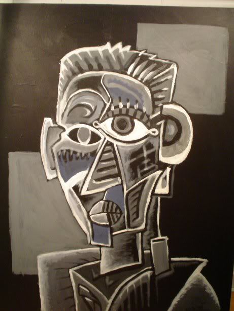
Now I'm getting back into the project, after having been absent for a while, I am growing increasingly unsatisfied with the work I produced back then. I have learnt a lot of new skills and techniques since then, and have decided rework things. The first of these things is the Anargo Crest. As you may remember, it looks like this: 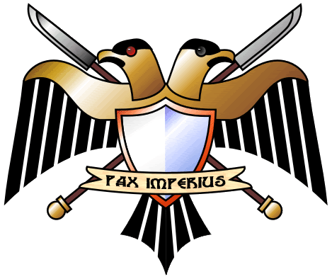 It was all well and good for its time, however I dont think it quite fits the imperial theme. Yes, it's a 2-headed birdy, but it's all round and smooth - imperial iconography is meant to be all angles and agression! This in mind, I have reworked the logo. While remaining true to the general idea of the old, I have made it much more Imperial in nature, sharper, more aggressive, and closer to the Imperial Eagle in terms of design. I have also refined my Metals technique to give more definition and shininess. So, without further ado (I've ranted long enough), I am proud to present my new design:  I'm pretty pleased with the way it turned out  Comments and constructive criticism wanted please. Note: I have a much larger version of the image available if required. This graphic would rock on a shirt! EDIT: Footnote - I realise the shield is pretty plain, I wasn't sure what to put on it so I stuck with the blue/white halves. An icon or other colours can easily be added. |
|
|
|
Post by Sojourner on Feb 28, 2005 17:11:16 GMT -5
*GASP*
Very nice indeed.
For the shield - a laurel? crossed lightning bolts? an Iron Halo?
I adore everything about it except the text. Doesn't look...archaic enough.
|
|
|
|
Post by Kage2020 on Mar 1, 2005 9:18:33 GMT -5
Wonderful. I agree about the text. A bit too Star Trek or tau for my liking. I'm not sure about the shield. Will have to think about it some more, though suggestions by other people would be great. Guess I'm going to have to equip the Anargan 'honour guard' with power halbards, or something...  *whistles in good mood at brilliant pictures* Kage |
|
|
|
Post by ZarkTheDamned on Mar 1, 2005 9:46:04 GMT -5
Its possible there was a design statement for the shield on the crest that I missed somewhere on the line, I'll have a dig around.
As for the text: I like the font, but I agree that it isn't very Imperial. I'll do a few alternatives.
BTW: 'Pax Imperius' was placeholder text iirc, I think there was meant to be a proper Anargo motto going there?
|
|
|
|
Post by Sojourner on Mar 1, 2005 9:51:04 GMT -5
Oh yes, it's a nice font...
..for Tau.
|
|
|
|
Post by Dazo on Mar 1, 2005 10:38:23 GMT -5
Hey hey lay of the font bashing I think it looks bloody great(need to change that font though ) Should it not read Pax Anargo, i'm not understanding that bit could some one enlighten me. |
|
|
|
Post by ZarkTheDamned on Mar 1, 2005 12:01:34 GMT -5
Hey hey lay of the font bashing I think it looks bloody great(need to change that font though ) Should it not read Pax Anargo, i'm not understanding that bit could some one enlighten me. Pax Imperius roughly translates as 'The Emperor's Peace' - it's a generic Imperial statement |
|
|
|
Post by Tynesh on Mar 3, 2005 4:58:10 GMT -5
Good Work Sir!
Can the text be put back on a scroll?
This would definitely make it more Imperial-like.
Gotta agree on the font change.
Tynesh
|
|
|
|
Post by CELS on Mar 4, 2005 13:00:10 GMT -5
Wonderful! Absolutely terrific! A perfect logo for the website, once we've put something on that crest. Now, I have a few further comments... 1) About the 'textbox', I feel that the font is alright. Something more gothic and Imperial might be better, but I'm not too concerned. 2) About the size... could you perhaps do a smaller version, possibly without the crest and textbox? (I'm not sure if it would look messy on a smaller version) Just as a small logo that we can insert here and there as our trademark? Maybe something like 200 x 200 or 300 x 300 pixels? 3) In keeping with all the other crests that have been done (and the whole tradition of crests), I think there should be a version where you have the eagle and halberds and whatever else on a shield. For the Anargo SR.  Just to clarify, I'm not saying we should throw away the one you've posted above. That is excellent for use on the website and such. |
|
|
|
Post by Rogue Trader on Mar 4, 2005 18:19:46 GMT -5
I quite like it, but I feel that there are a couple of improvements that could be made; the halberds and the shield edge look a bit dodgy to me and, as others mentioned, the text should be more gothic... perhaps on a scroll?
|
|
|
|
Post by Kage2020 on Mar 5, 2005 16:49:41 GMT -5
What about a pole-like object that is not a halberd? It might make it a little less... blocky?
Shield for Anargo SR... Don't know yourself out for this one, Zark. I'm not overtly concerned for some form of heraldic image for Lord Anargo, since that is more likely to be different than an "Anargo sector" crest, which is just illustrative of the project rather than the world...
Kage
|
|
|
|
Post by Rogue Trader on Mar 6, 2005 5:34:28 GMT -5
What about a pole-like object that is not a halberd? It might make it a little less... blocky? KageIt's more the design of the halberd... I'd post a picture of the changes that I'd make to the crest but I haven't got access to a scanner...  |
|
|
|
Post by ZarkTheDamned on Mar 7, 2005 18:27:45 GMT -5
OK, some revisions made: 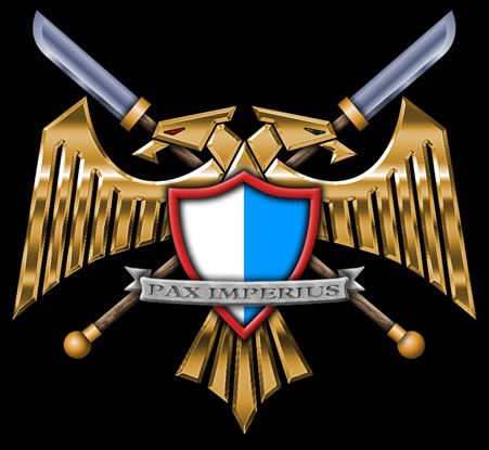 Changes: Removed Chroming from the Halberd blades and bindings Made Halberd Butts more Spherical in appearance Removed Chroming from Shield edge; adjusted colour of shield edge slightly to compensate Changed Metallic bar for Stone Scroll Changed hi-tech font for a more gothic one Aliassing is a bit less harsh on the wings I tried a version without the shield, but it looked too empty in the middle... |
|
|
|
Post by CELS on Mar 8, 2005 4:51:22 GMT -5
Looks great to me. What program did you use to draw the crest by the way? If you don't want to make a crest for the SR, perhaps I can do it. I'd also be interested in adding some details to the blue and white shield, like a laurel to represent the capital, a power maul to represent the Gaius system and the Arbites, etc.
I know what you're thinking; "Enough with the crests already!", but to me, they're important little details that add a lot of character.
|
|
|
|
Post by ZarkTheDamned on Mar 8, 2005 7:33:44 GMT -5
I used Fireworks to make the latest version, I find that it is far more precise with its vector points than any other porgram I've tried so far (and it has a good exporter too). I don't mind doing more crests, it'll just take time |
|